Five Ways to Build Invisible Payment Experiences
“Good design is in all the things you notice. Great design is in all the things you don’t.”
Wim Hovens
Payments are on a roll. The past few years has seen tremendous growth and innovation in the sector, with heavy M&A and fintech disruption helping to stir the pot. Behind the scenes innovation has resulted in payment experiences that are incredibly fast, reliable, secure and flexible, allowing businesses to turn payment processing from a transactional service to a transformational approach to increasing margins and reducing costs.
But from a consumer’s perspective, these background details don’t matter. Parting with hard earned cash is difficult at best, and outright painful in some circumstances. The best payment experience you can provide for your customers is the one they barely even notice. The goal, then, is to strive to create invisible payments whenever and wherever possible.
Invisible payments are experiences that offer the least amount of friction between initiating and completing a payment. When done correctly, customers should be able to finish a transaction without breaking focus to reach for their wallet, refresh the page or search for help.
Hidden in Plain Sight
In recent years, consumer technology companies have become the masters of invisible payments. Look how companies like Uber and Amazon seamlessly integrate payments into their business models.
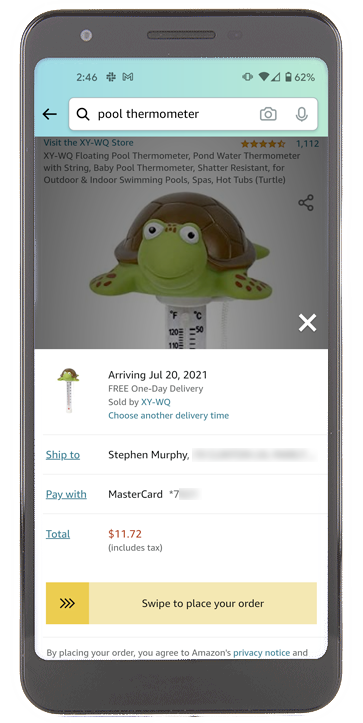
When you’re shopping on Amazon, you don’t have to “complete a payment”, you simply have to “place your order”. You never lose sight of the product you came to buy. You don’t have to type in the same information you’ve already given them. All you have to do is swipe right and check your mailbox in a couple days.
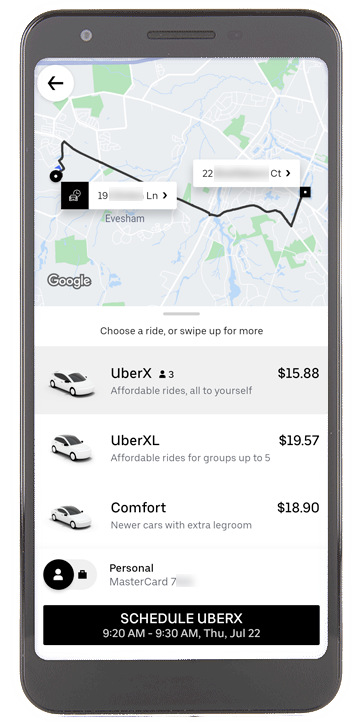
Uber takes you through a similar process. Instead of explicitly “making a purchase” in the traditional way, the app simply prompts you to schedule your ride. The payment is incorporated into the booking process, showing you in real time how far away your next ride is. Just click “Schedule” and you’ll be on your way.
Now contrast these experiences with the last time you paid a loan or utility bill. These interactions often involve more effort and unnecessary friction. And let’s not forget the biggest difference: unlike online shopping (which can be fun), most people don’t want to pay bills—they have to. This can make the payments process even more painful.
The Great Balancing Act
While the goal of invisible payments is reasonable on the commerce side of the world, billers have a moral obligation to keep the process somewhat visible. After all, you want your customers to be aware of how much they are paying and when the transaction will process.
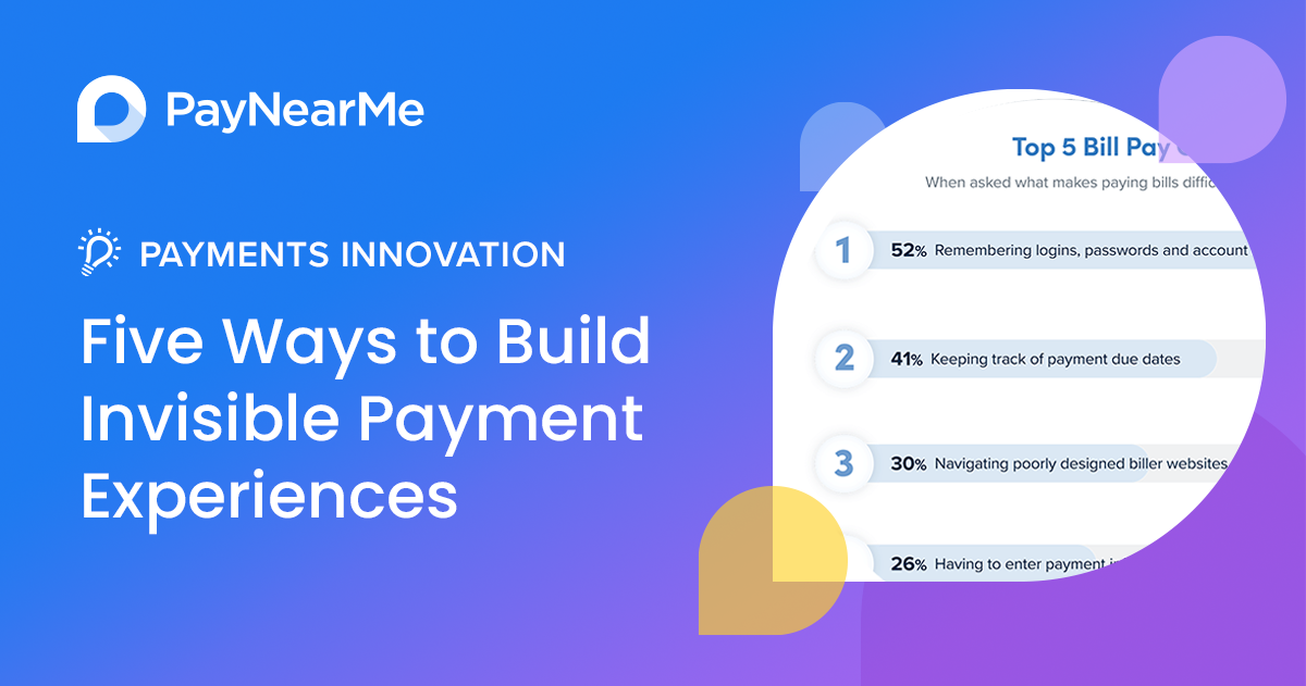
This is where it pays to be aware of your customers’ biggest bill pay challenges. For example, in a PayNearMe research survey, U.S. consumers shared five areas of the bill pay experience that cause them the most stress:
Focusing on improving these challenges is an excellent way to drive towards a frictionless payment experience that most closely aligns with the invisible payments found in consumer commerce experiences.
Solving for the Big Five
There is no universal way to remove friction from the bill pay process. Every business will have its own priorities and constraints, and every customer will have their own preferences. Regardless, there are proven methods that have widespread appeal that can help you solve for the most difficult bill pay challenges.
Remove Login Issues by Streamlining Logins
More than half of respondents in the survey said that remembering logins, passwords and account numbers was the most challenging part of bill pay, making it the top priority for billers to tackle. When customers can’t access their online accounts, they often turn to more expensive and resource intensive payment options, such as calling into your contact center, sending mail or visiting in-person. In some cases, they may fail to complete the payment at that moment, resulting in higher delinquency rates.
PayNearMe Smart Link™ solves this issue by greatly reducing the friction in the login process. Each Smart Link is unique to the customer, and when clicked (or scanned via QR code) sends the customer directly into the payment flow. This allows fast payment access for all of your customers, while still concealing sensitive information, such as account numbers or payment history, behind a login.
Billers can configure Smart Link technology to reveal or conceal additional types of information as well, depending on security, risk and compliance requirements.
Promote Timely Payments with Reminders
Keeping track of payment due dates wasn’t far behind login issues, with 41% of those surveyed calling this challenge out. Billers aren’t completely to blame for this, as different customers prefer different ways to receive payment reminders, including paper statements, emails, phone calls, texts and more.
The obvious answer is to meet the needs of various customer groups by offering more reminder options. Aside from paper statements, you can send automated, scheduled SMS, email and push notification messages to customers. These reminders have the benefit of reaching your customers wherever they are, while incorporating Smart Links to create simple click-to-pay experiences.
Some billers may even wish to create time-based reminder streams—for example, sending a reminder a week before and the day of the due date (and in the event of a non-payment, a few days after).
Customers who use digital wallets may also want to receive push notifications, a surefire way for you to break through the clutter and reach customers fast.
Simplify the Mobile User Experience
Nearly a third of consumers polled said that navigating poorly designed biller websites was a challenge. There are many factors that can affect this, but one stands out above the rest: poor mobile experiences.
More than half of all internet traffic today is mobile, and yet many biller payment systems fail to provide a user experience that works on all devices. As we’ve talked about previously, apps aren’t the answer for a majority of billers, as customers don’t want to install dozens of new apps just to pay their once-a-month bills. Instead, opt for a mobile responsive website that can incorporate the benefits of an app without all the downfalls.
Here are a few tenants of good mobile design:
- Works on all devices, regardless of platform or screen size
- Does not require an app to be installed or updated
- Recognizes and adapts to different devices (for example, showing Apple Pay as a payment option on iPhones or iPads)
- Loads quickly regardless of connection speed, especially in rural or remote areas
- Uses smart inputs (for example, using a number pad instead of a full keyboard for card input fields)
Offer Easy Ways to Autopay
Slightly more than a quarter of consumers surveyed cited entering payment data as a challenge in the bill pay process. This is perhaps the simplest problem to solve, as many payment providers offer ways for customers to save their previously used payment methods. Autopay is another solution, allowing customers to add their payment information once and never worry about it again.
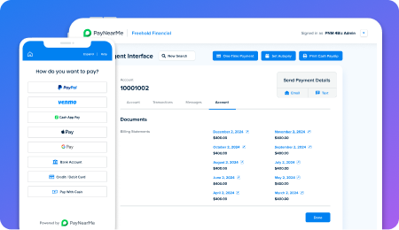
Still, there are other approaches you can take to make the process appeal to even more customers. Offering mobile-first payment methods such as Apple Pay and Google Pay can streamline the process by letting customers use cards already in their mobile wallets. This negates the need to ever type in payment details, especially for those making a payment for the first time. These payment methods can also offer an extra layer of security for those nervous about saving their card data across multiple websites .
To help reduce user input errors, try adding visual guides to help your customers easily confirm their entries. Showing a check or card image that fills in the numbers as you go and mimics their physical counterparts can easily prevent mistyped data.
Provide Easy Access to Payment History
Rounding out the top five, 23% of consumers surveyed indicated that keeping track of the amount owed each billing cycle made bill pay difficult. This can be particularly challenging in variable billing environments that change each month, such as utilities payments. Those who pay installment-based payments aren’t immune to this challenge either, as late fees, interest rate adjustments or other factors could potentially change the monthly payment amount.
There are a few small tweaks you can make to your billing process to address this challenge. Prefilling the “amount owed” field in your online payment forms is a simple way to streamline the payment process. Showing customers a list of past payments can also help show them their history and is especially helpful when customers make payments above and beyond what is owed.
Finally, offering integrated ebills into your online payment experiences can give customers a much more detailed view into what they owe each month. This can be done by importing a PDF directly from your statement provider, or by creating custom fields configured to pull that information directly into your payment forms. Doing this helps prevent bad customer experiences and can reduce customer service calls to your contact center.
On the Path to Invisible Payments with PayNearMe
PayNearMe helps you move toward invisible bill payments for your customers, with our all-in-one, easy to use platform. You can easily incorporate all the recommendations shared above using the PayNearMe platform, along with other industry best practices for a brilliant user experience.
Learn more by viewing our instant demo, or by requesting a personalized walkthrough today.

